UserGuiding Feature
Banners
UserGuiding allows businesses to show small notification banners inside their products, think of it like a pop-up strip that appears while you're using an app, letting the company share announcements or updates without interrupting your flow. I designed this feature end-to-end: how it's created by the business, how it looks to the end user, how it adapts to different languages and screen layouts, and how it fits into the existing product without feeling out of place.
Role
Product Designer
Duration
6 Weeks
Platform
SaaS / B2B
Year
2025

Goal
Replace the workaround behavior that existing users had built around seasonal promotions, using unrelated features to approximate what a proper banner system should do. And bring that capability natively into the product before the next campaign season.
Impact
Covered 85% of the existing workaround user base in the first campaign season. On top of that, 25% net new users who hadn't been using any workaround adopted the feature, expanding the reach beyond the original target audience
01. CONTEXT
Why did this feature exist?
UserGuiding operates in a dual-layer environment: product teams build in-product experiences inside the platform, and those experiences are then delivered to their own end users. This structure means every design decision affects two audiences simultaneously, the person configuring the feature, and the end user seeing it inside a live product.
Existing communication tools were primarily overlay-based. They covered content, disrupted layouts, and gave product teams almost no placement control. The result was a recurring pattern of support tickets, workarounds, and developer escalations.
"Teams couldn't place messages reliably without covering critical UI, and there was no native way to show time-sensitive content without overlay behavior."
The opportunity was clear: design a banner system that integrates into the page flow, respects the host product's layout, and gives configuration teams precise, predictable control.
02. PROBLEM DEFINITION
What was broken, and for whom?
Problem definition was grounded in three sources: support ticket analysis, sales call insights, and existing user interview outputs. This wasn't a product hypothesis, it was a documented pattern.
Positioning Limitations
Teams couldn't reliably place messages without covering critical interface elements, often needing developer support to resolve layout conflicts.
No Dynamic Messaging
There was no native way to display real-time or time-sensitive content, making contextual communication structurally impossible.
Missing Native Integration
Customers needed messages that behaved as part of their product, integrated into the page flow instead of floating above it.
Overlay Dependency
All existing tools relied on overlay behavior, which limited placement control and created inconsistencies across different interface environments.
03. DESIGN APPROACH
How I structured the work
Before opening Figma, I mapped the full scope and aligned with engineering on constraints. Because this feature renders inside external product interfaces, behavioral predictability wasn't optional, it had to be defined before design began, not after.

I also conducted competitive benchmarking across products with banner functionality, documenting features, interaction patterns, and edge cases before wireframing. This prevented redundant design decisions and helped me answer stakeholder questions without hesitation.


The process was iterative: IA and scope first, then low-fi alignment with developers, then user flows, then high-fi. This sequence was intentional, structural decisions had to be validated before visual ones.
04. INFORMATION ARCHITECTURE
Building the structure before the screens
For most projects, I start with IA before wireframing and user flows. For this feature, I needed to establish the structural backbone first. How banners would fit within UserGuiding's existing feature set, and what the configuration hierarchy would look like.
The IA defined four primary areas: Banner Templates, Reports, Configuration, and the Editor (split into Content, Layout and Display tabs). This structure directly informed the navigation model and scoping decisions.

Just before dive into the user flows, I had to see the overall positioning of the feature in the current product. So I prefered to draw some low-fi wireframes to be aligned with DEV and Product Teams, and continue with the solid ground

05. USER FLOWS
Mapping the experience
The flow was large enough that I divided it into sections: creation & setup, targeting & audience rules, scheduling & frequency, and delivery & engagement tracking.

The most difficult part in this flow was identifying the triggering options after the user dismisses or closes the banner. Because dismiss action and close action behaves different and it effects the reports and showing the banner more than one time. I've decided to do this setting like I do in Survey feature because it should be consistent in product. And it means I had to add showing frequency settings for dismiss button.

And for the Editor part; Banner placement options should have been in the same horizontal hierarchy because it affects the auto full width, outer margins and banner position.
If the banner stays sticky, it should be full width.
If the banner should push the native page elements down, it should be on the top side of the page.
These decisions affects the experience directly because I have to do some parts disabled or auto switch. And it also depends on the DEV teams' capabilities.
06. DESIGN EXPLORATION
Make the positioning
The direction we chose prioritized placement explicitness over visual simplicity. Product teams needed to understand exactly where a banner would render before publishing (ambiguity here would generate support tickets). The selected approach made positioning logic visible in the editor, not buried in settings.
Annotations on the yellow sticky notes always help the developers to understand the behavior in that phase. Their expectations of final design screens have taken shape.


07. FINAL DESIGN
The Solution
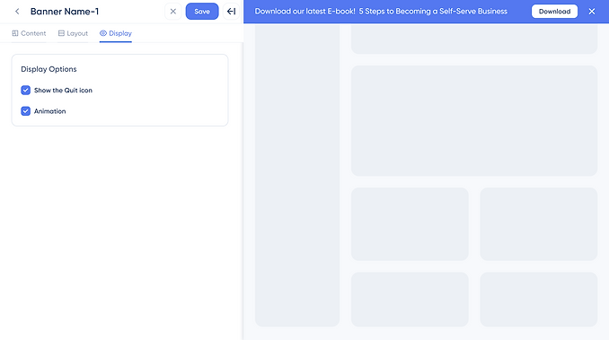
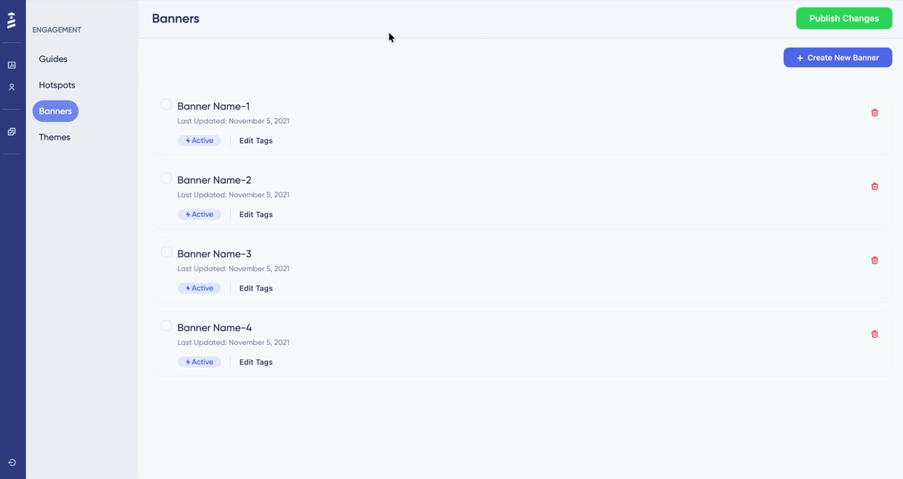
The final design introduced a layout-aware banner system with 7 primary surfaces: the template selector, the reports page, the configuration page, the content editor, the layout editor, the display editor, theme settings. Each surface was designed with the dual-user structure in mind, configuration for product teams had to be precise, and behavior for end users had to be predictable.
Template Selector

Reports Page

Configuration Page

Editor > Content Tab

Editor > Layout Tab

Editor > Display Tab
Theme Settings

08. PROTOTYPE
Making it tangible
The prototype was built using Figma's prompt-based prototyping feature (Figma Make), my first time using this approach. It allowed rapid iteration across multiple interaction states without manually wiring each frame. The prototype covered the full configuration flow: creation, placement setup, audience targeting, and scheduling. The design elements are not exactly same with the UserGuiding Design system because Figma Make couldn't use the elements correctly.
09. VALIDATION
Testing with the right people
Test Overview
- Objective: Evaluate the usability and intuitiveness of the new Banner feature
- Participant: Colleague unfamiliar with the Banner feature
- Duration: 25-30 minutes
- Method: Think-aloud protocol with task-based testing
- Focus Areas: Feature discovery, New theme discovery, editor usability, content creation & Edit
Key friction points identified during validation:
Placement Visibility
Users wanted to confirm exact render position before publishing. This led to a preview improvement in the layout editor.
Behavioral Predictability
Engineering needed clearer annotation around dismissal logic and responsiveness rules. Final deliverable included detailed behavioral specs.
* Due to privacy considerations, raw session data is not shown. Findings are based on anonymized feedback and internal evaluation scenarios.
10. OUTCOME & LEARNINGS
What shipped and what I took away
The feature introduced a new in-product communication capability that integrates into the page flow rather than overlaying it. Banners could now be placed precisely, styled consistently through the theme system, and tracked within the existing reporting infrastructure.
Beyond the interface, this work contributed to the platform's structural communication layer, establishing patterns that future messaging features can build on.
Key Learnings
Structural Decisions = Usability Decisions
How a feature is architecturally organized directly shapes how usable it is. IA isn't a deliverable. It's a design decision.
Early technical alignment saves time
Aligning with engineering before high-fi reduced downstream ambiguity significantly. Behavioral specs in the final deliverable cut back-and-forth.
Two audiences, one system
Designing for both creators and end users requires holding both mental models. Optimizing for one at the expense of the other creates problems downstream.
RTL is structural, not cosmetic
Supporting right-to-left languages can't be bolted on visually at the end. It requires structural consideration from the first wireframe.
Check My Other Projects in UserGuiding