UserGuiding Feature
Knowledge Base
Most software products have a help center, a collection of articles users can search when they're stuck. UserGuiding's Knowledge Base feature lets businesses build and manage that help center directly inside their product, turning it into a searchable, structured self-service support system. I redesigned the entire experience: how content editors organize and publish articles, how end users search and navigate them, and how the system scales when a company manages multiple products with different audiences.
Role
Product Designer
Duration
8 Weeks
Type
Feature Design
Year
2024

Goal
Increase long-term revenue per user by making the Knowledge Base a core part of the product experience, not just a support tool. The hypothesis was users who actively engage with the Knowledge Base would show higher ARPU and LTV over time, because better-informed users get more value from the product and churn less.
Impact
The feature shipped to the existing subscriber base and exceeded adoption targets. Users who engaged with the Knowledge Base showed significantly stronger retention and revenue metrics compared to non-users, validating the original hypothesis that self-serve knowledge engagement correlates directly with long-term account value
01. CONTEXT
More than a help center. It is a content system
UserGuiding's Knowledge Base feature lets product teams create and publish a fully branded help center for their end users. On the surface, it looks like a documentation tool. Under the hood, it's a content management system with multilingual support, role-based publishing permissions, category hierarchy, elastic search, and engagement analytics.
The feature also needed to work in three directions: as a standalone public page on the customer's own domain, as an embeddable widget inside the Resource Center & mobile view, and UserGuiding Panel where you can design and edit the standalone page that shown to end users. This requirement shaped structural decisions from the beginning.
"The question wasn't 'how do we add projects?' It was 'what breaks if we do, and how do we make sure nothing does?"

02. HIERARCHIES & STRUCTURE
Building the content hierarchy before the UI
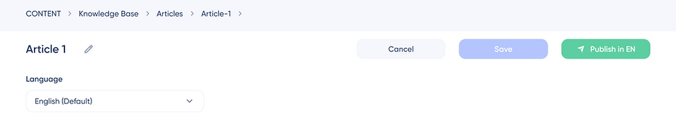
The Knowledge Base has a four-level hierarchy: Knowledge Base → Category → Article → Language Variant. Each level has its own status, its own permissions, and its own set of actions. Getting this structure right before any wireframing was essential, every UI decision downstream depended on it.
On the other hand, the are panel architecture, panel category structure and standalone structure. Panel page settings and reports structure are detailed and huge, so I couldn't show it in one high resolution screen.
This Knowledge Base feature needed a strong building both for UI and Hierarchies.


Object Level (Article)
Category assignment, related articles, publish/unpublish across all languages, delete. These actions affect the article as a whole, regardless of language.
Language Variant Level
Save draft, publish in specific language, unpublish specific language version. These actions are language-scoped, publishing in English doesn't publish in Turkish.
The key structural insight
An article and its language versions are not the same object. An article can exist (be created) without any language version being published. A language version can be published while another is still in draft. This distinction had to be explicit in both the data model and the UI. Otherwise the system would constantly confuse users about what they were publishing.
03. THE HARDEST PROBLEM
Localization. Statuses, permissions, and what 'published' means
The localization structure was the most complex design challenge in this project. Every article exists in multiple language versions, each with its own status. And the status of the article as a whole, what appears in the category tree, what's visible to editors, depends on the combination of statuses across all its language versions.
Article statuses and what they mean
A category's visible status is determined by its content: Published means at least one article is published or published with pending draft. Needs a Title means the category has no title yet. No Article means the category has no articles at all. Draft means all articles inside are in draft state.
An article's status per language: Not Translated means no version exists for the selected language. Published means the selected language version is live. Published with Pending Draft means a live version exists but there's an unpublished update waiting. Draft means a version exists but hasn't been published yet.

The role permission layer on top
Editor and Admin roles have different permissions across these statuses. An Editor can create and save drafts but cannot publish, only Admins and Publishers can publish or unpublish. This means the same article editor UI needs to show different available actions depending on the user's role, without making the interface feel broken or incomplete to either user type.
Language dropdown behavior, a subtle but critical detail
When a user changes the language dropdown on the categories page, the entire page updates to show content as it appears in that language. Category names, article statuses, featured articles, subcategory titles, all reflect the selected language's state. This sounds simple but created significant complexity: some content doesn't exist in the selected language yet, some is in draft, some is published. The UI had to communicate all of these states coherently without becoming overwhelming.


The default language edge case
If a user changes the default language in Page Settings or Categories page, it affects everything: the Add Article drawer shows categories in the new default language, article titles reference the new default, and the category structure reorders accordingly. This had to be mapped explicitly, changing the default language is not a cosmetic change, it's a structural one.
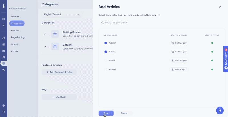
04. CATEGORY TREE
Tree view, the UI that had to do the most work
The category tree view in the panel is the primary interface for organizing all Knowledge Base content. It shows categories, subcategories, articles, and their statuses. All in a collapsible, drag-and-drop structure. This single UI surface had to communicate more information than almost any other screen in the feature.
Inline creation and the naming placeholder problem
When a user adds a subcategory, it appears immediately at the bottom of the parent category in a typing state, with a placeholder name. The category collapses or scrolls to reveal the new item. The placeholder persists across all language versions until the user types a name for the selected language. This means a subcategory can exist structurally before it has a name in any
language, a state the UI had to handle gracefully.
Name length constraints
Category names, subcategory names, and article titles all have length constraints that affect how they appear in the tree view, in navigation, and in the public-facing Knowledge Base. These weren't arbitrary limits, they were driven by the tightest display context each piece of content appears in. Defining these limits required mapping every surface where the name would appear.
Drag and drop. Moving content between levels
Articles and subcategories can be reordered within their parent via drag and drop, and articles can be moved between categories. The rules here were specific: subcategories can only move within their parent category, not to a different category. Articles can move to any category. These constraints had to be communicated through the interaction itself, not through error
messages after the fact.

05. PUBLIC SURFACE / STANDALONE WEB & MOBILE
What end users actually see
The public-facing Knowledge Base is what the product team's end users interact with. It had to be fully customizable (themes), responsive across devices, and coherent whether accessed directly or embedded inside the Resource Center widget.
Knowledge Base Standalone Homepage

Subcategory Page

Article Page

Elastic search, designing for a technology, not just a UI
The Knowledge Base uses elastic search, which means search results are ranked by relevance rather than simple keyword matching. This had UX implications: the search experience needed to feel instant and intelligent, with keyword highlighting in results and a clear path to 'see all results' when the dropdown preview is insufficient.


The search reports surface was equally important: which keywords users searched for, how often each keyword appeared, and the article click rate per search term. This data helped product teams understand what their users couldn't find, and was directly actionable for improving content coverage.
Mobile Responsiveness
The Knowledge Base had to work across all screen sizes, not as a mobile app, but as a responsive web page. This required defining behavior for each layout breakpoint: how categories collapse, how the tree navigation adapts, how the search experience changes on smaller screens.
Custom Domain
Product teams could publish their Knowledge Base on their own domain. This meant the design had to account for a completely different URL structure, SSL configuration, and the possibility of the Knowledge Base existing as a standalone product, not just an extension of the UserGuiding panel.


06. REACTIONS & ANALYTICS
Closing the loop, measuring what content actually works
Every article includes a reaction widget: three emoji options representing positive, neutral, and negative feedback. These reactions feed into the reporting system, giving product teams visibility into which articles are helpful and which aren't.


The reports system was designed around two distinct views: Page Reports (overall Knowledge Base traffic) and Article Reports (per-article performance). Each view had its own filtering logic, language selection, date range, and in the article view, the ability to drill down into individual article performance with a side drawer.
Page Reports
Total page views, unique viewers, daily/weekly/monthly view chart, total reaction distribution (positive/neutral/negative %), search results table with keyword frequency and article click rates.
Article Reports
Per-article view count, unique viewers, reaction count, category, last updated. Filterable by language and date. Drill-down drawer shows language-specific performance for individual articles.
Page Report

Article Report

Why reactions matter more than view counts
View count tells you what people found. Reaction data tells you whether it helped. Designing the reaction system as a first class reporting feature, was a deliberate decision to give product teams actionable signal, not just traffic data.
07. MIGRATION & INTEGRATIONS
Meeting users where their content already lives
Many product teams already had a Knowledge Base, in Intercom, Zendesk, or other tools. Requiring them to recreate all their content manually would have been a significant adoption barrier. The migration feature allowed users to import their existing content directly into UserGuiding's Knowledge Base.


The design challenge here was trust: users were being asked to hand over their existing content to a new system. The migration flow had to be transparent about what would be imported, what would be mapped, and what might not transfer perfectly, setting accurate expectations before the import happened, not after.
10. OUTCOME & LEARNINGS
What this project revealed about content systems
The Knowledge Base shipped as a complete feature: public page, panel management, multilingual support, custom domain, elastic search, reactions, analytics, and migration from third-party tools. It became one of UserGuiding's most used features for teams with support-heavy products.
Key Learnings
Content and language are orthogonal axes
An article's existence and its language versions are separate concerns. Conflating them, treating 'article' and 'English version of article' as the same thing, would have broken the entire localization model. Getting this distinction right at the IA level prevented countless UI problemsdownstream.
Status systems need a source of truth
When content has multiple statuses at multiple levels (article status, language version status, category status derived from article statuses), there has to be a single clear rule for how they compose. Defining this rule explicitly (and mapping every edge case) was the most important design work in the project.
Role permissions change what 'the same UI means
An Editor and an Admin looking at the same article editor see a different set of available actions. Designing for this without creating two separate interfaces, and without making either user feel like something is broken, required
careful thinking about progressive disclosure and state visibility.
Analytics should answer questions, not just show data
The reports system was designed around specific questions product teams actually ask: 'What are my users searching for that they can't find?' and 'Which articles are actually helping?' Designing from the question, not from the data, made the reporting UI significantly more useful.
Migration is a trust problem, not a technical problem
Users importing content from Intercom or Zendesk are trusting the new system with their existing work. The design of the migration flow had to earn that trust, through transparency, clear expectations, and a recoverable process if something went wrong.
Responsive is not a final step
Building mobile responsiveness into the design from the beginning, not as a post-desktop adaptation, changed decisions about information density, navigation patterns, and component choices across the entire public surface.
Check My Other Projects in UserGuiding

