Interview Case Study
VivA App
An AI-powered health & wellness mobile app, designed from zero to high-fidelity prototype in one week, as part of a design interview challenge.
Role
Product Designer
Duration
1 Week
Platform
Mobile App
Year
2025

01. CONTEXT & CONSTRAINTS
One week. Zero to prototype.
This project was given as a design interview challenge: design a health & fitness mobile app from scratch. No existing product, no existing users, no existing data. Just a brief and a deadline.
The constraint wasn't just time, it was scope. A health app that does everything (fitness, nutrition, sleep, mental health) for everyone is too broad to design well. The first job was to narrow the focus without losing the ambition.
The brief was open-ended on purpose. How you scope, prioritize, and make decisions under pressure is what's being evaluated, not just the final screens.
What I chose to focus on
The core insight from competitive research: every major health app is specialized. MyFitnessPal for nutrition, Fitbit for activity, Calm for mental health. None of them offer AI-driven personalization across all wellness categories in one place. That gap became VivA's positioning.
02. RESEARCH & BENCHMARKING
Understanding the market before drawing a single screen
I started by benchmarking both the company's existing products (to understand their design language and patterns) and direct competitors in the health & wellness space. This wasn't surface-level research — I documented onboarding flows, monetization strategies, navigation patterns, and UX friction points for each product.

What competitors do well
Deep category specialization (Fitbit for activity tracking, MFP for nutrition logging). Clear premium value propositions. Strong data visualization. Established trust through accuracy.
Where the gap is
No single app offers personalized AI guidance across fitness, nutrition, sleep, and mental health simultaneously. Users currently juggle 3-5 apps to cover their wellness needs. This fragmentation was the opportunity.

Branding decisions were made deliberately: blue for technological trust (AI-forward product), teal for natural wellness, Proxima Nova for its established use in successful wellness brands. The logo uses a 'V' that doubles as a person doing a sit-up, connecting the name to the product's purpose.
03. PRODUCT STRATEGY
Defining what to build and what to leave for later
With one week and no team, scope decisions were existential. I defined product-market fit, a phased roadmap, and an MVP specification before touching any design tools. These weren't decorative deliverables. They were the constraints that made every subsequent decision faster.


Two target personas
Gen Z / Millennials (16-28): fitness-focused, body transformation goals, motivated by social proof and visible progress. Busy Professionals (28-45): holistic wellness, time-constrained, need efficiency and measurable results.
Competitive advantage
Unlike MyFitnessPal (tracking-only) or Fitbit (hardware-dependent), VivA offers comprehensive AI-driven goal achievement across all wellness categories in a single platform.
MVP scope decision
The MVP focuses on: user onboarding with goal setting (fitness, nutrition, sleep, mental health), a basic AI assistant with personalized recommendations, goal tracking and progress visualization, and a simple reminder system. Social features, wearable integrations, and advanced analytics are explicitly post-MVP, keeping the core focused and buildable.
04. DESIGN THINKING FRAMEWORK
Discover → Define → Ideate → Prototype
I chose the Design Thinking framework for this project because health apps require deep understanding of user psychology and behavior — not just task flows. Building empathy for why users fail to maintain wellness habits is as important as designing the screens that help them succeed.
Discover (Personas & Empathy)
Two personas were defined to cover the two target markets: Fiora (The Fitness Enthusiast, 21) and Willie (The Busy Professional, 35). Their key differences; time availability, motivation type, and definition of success. Shaped every navigation and feature priority decision.


Define (Problem Statements)
Five functional problem statements were defined, each mapping to a product opportunity: Fragmentation (users juggle 3-5 apps), Personalization Gap (generic recommendations don't fit individual constraints), Motivation & Consistency (users abandon goals after 2-3 weeks), Information Overload (conflicting health advice causes decision paralysis), and AI Integration Opportunity (no existing app offers contextual, adaptive AI guidance).

Ideate (Brainstorming & Affinity Mapping)
I used HMW (How Might We) questions to generate ideas across five problem areas, then used an affinity map to categorize and prioritize. The affinity mapping revealed three natural feature clusters: Goal Management & Personalization, AI & Recommendations, and Progress & Motivation.


05. INFORMATION ARCHITECTURE & USER FLOW
Structure before screens
The app's navigation was defined by the two personas' primary needs. Fiora needs quick access to daily fitness tracking and progress. Willie needs an AI coach that surfaces what matters without requiring him to navigate deep menu structures. The tab bar. Today, AI Coach, Discover, You, More — was designed to serve both without compromise. The IA was mapped across 4 hierarchy levels before any screen was designed. This revealed which features belonged at which depth, prevented redundancy between tabs, and made the eventual wireframing significantly faster, every screen had a known place in the structure before it was drawn.

The user flow mapped every branch: permission denial paths, onboarding quit-and-resume behavior, pro plan subscription flow, and how first-time vs returning users experience each tab. This level of detail was necessary because onboarding drop-off and premium conversion are the two highest-stakes moments in any freemium wellness app.


Onboarding as a design challenge
A 3-step onboarding that collects goal type, activity level, dietary preferences, and scheduling constraints, without feeling like a survey. Each step had to feel like personalization happening in real time, not data collection for later. This framing changed the copy, the visual feedback, and the step structure.
06. WIREFRAMES
Low-fi to high-fi in one week
Prototyping happened in two stages. First, paper sketches to validate layout logic and navigation. Fast enough to throw away and redo without sunk cost. Then, wireframes to establish component structure and content hierarchy before committing to visual design.


07. DESIGN SYSTEM
Building the system to build the product
Before high-fi screens, I built a complete design system from scratch: tokens (colors, typography, spacing, grids), and a component library covering every UI element the app would need. This wasn't overhead, it's what made building 14+ screens in one week possible without inconsistency.

Token system
Color tokens across primary, secondary, neutral, success, warning, error, and dark semantics. Typography at title, headline, body, and label scales with 5 weight variants. Spacing and grid documented for consistent layout.
Component library
Atomic components built first (buttons, inputs, checkboxes, tags, progress indicators), then composed into molecules (cards, list items, navigation) and organisms (dashboard sections, AI chat interface, onboarding steps). All Auto-layouted.
08. FINAL DESIGN
From system to screens
The final high-fidelity screens were built on the design system, following the user flow, and informed by the personas. Every screen decision traces back to a research insight or a strategic constraint, nothing was designed for aesthetics alone. The role was dedicated to be a UX designer, not focusing on UI part that much, so I've decided to not focusing on the UI aesthetics because of the time limit.
Start

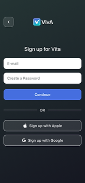
Login

Signup
Onboarding-1

Onboarding-2

Onboarding-3
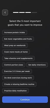
Onboarding-4

Pro Plan Push

Today Page

AI Coach Page

Discover Page

You Page

10. OUTCOME & LEARNINGS
What one week, done right, can produce
VivA went from brief to high-fidelity prototype in 7 days: branding, product strategy, competitive research, two personas, empathy maps, customer journey map, problem statements, brainstorming, affinity mapping, IA, user flow, wireframes, design system, and 14+ high-fi screens. The prototype is fully navigable.
The project demonstrated that a structured design process isn't slower than skipping steps, it's faster, because every decision downstream has a foundation to stand on.
Key Learnings
Scope is the first design decision
The choice to position VivA as an AI-unified wellness platform — rather than another single-category tracker, was made in the first hour. Everything else followed from it. Getting the positioning right before opening Figma saved days of misdirected work.
Process creates speed, not slowness
Spending time on personas, problem statements, and affinity mapping felt like overhead, until wireframing started. Every layout decision had a user rationale. Every feature had a problem it was solving. The screens took hours, not days.
A design system is worth the upfront cost
Building the component library before the screens meant each new screen was assembly, not invention. Consistency was automatic. Changes were propagated everywhere. The system paid for itself by screen 4.
Freemium design is a product strategy, not a feature
Where the pro upsell appears, what it shows, and how it's framed in relation to user progress is a retention and monetization decision disguised as a UI decision. Getting this wrong loses revenue. Getting it right feels natural to the user.
Mobile design forces clarity
Every screen on mobile is a prioritization exercise. There's no space for 'nice to have'. Working in mobile-first constraints made every content and hierarchy decision more intentional, a discipline that transfers to any platform.
Interviewer's lens: what they're actually evaluating
The brief was open-ended on purpose. The evaluation wasn't about the health app, it was about how I think, prioritize, justify decisions, and execute under constraint. Every deliverable was an answer to an implicit question about design maturity.
Check My Other Projects in UserGuiding