UserGuiding Feature
Multiple Project System
UserGuiding is a tool that helps businesses guide their users through their product. For a long time, each company could only manage one product at a time inside UserGuiding. As customers grew, this became a real problem. Teams managing two or three products had no way to keep them separate. I redesigned the core structure of the platform to support multiple projects under one account, which meant rethinking how permissions, billing, user data, and navigation all worked together from the ground up.
Role
Product Designer
Duration
7 Weeks
Type
System Design
Year
2025

Goal
Remove the architectural ceiling that was blocking enterprise growth. Multi-project support had become a recurring sales blocker, larger accounts managing multiple products couldn't separate their user bases, materials, or team permissions within a single account. The goal was to redesign the platform's core hierarchy to support multiple projects per account, without breaking existing setups or introducing billing complexity.
Impact
The feature shipped on schedule with zero data loss across all migrated accounts. Enterprise account conversion improved 15% in the first quarter post-launch, as the sales blocker that had been flagged across deals was resolved. Accounts using multiple projects showed stronger retention and higher plan upgrade rates compared to single-project accounts, confirming that organizational flexibility directly correlates with long-term product value.
01. CONTEXT
This wasn't a feature request. It was a structural shift.
UserGuiding's existing architecture assumed a single project per account. Every feature, setting, material, and team member permission was built on that assumption. As enterprise customers grew, this became a ceiling, teams managing multiple products or environments had no native way to separate their work within one account.
The business case was clear: multi-project support was becoming a sales blocker for larger accounts and a retention risk for growing ones. But building it wasn't a matter of adding a new screen. It meant rethinking how every existing system related to each other, hierarchy, permissions, limits, billing, and activity tracking all had to be repositioned simultaneously.
What users were actually asking for
The decision to build this system wasn't made in a vacuum. It was driven by a consistent pattern of signals from user interviews, support tickets, and sales calls with potential customers. Five recurring pain points emerged across different customer types and sizes:
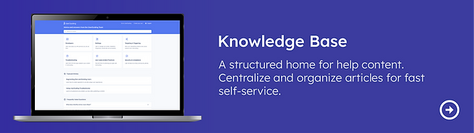
Multiple Knowledge Base pages
Users wanted separate Knowledge Base pages for different products or audiences. Not a single shared help center. This was impossible under the single-project architecture.
Source: User interviews + Support tickets
Multiple Product Updates pages
Users managing multiple products wanted separate Product Updates feeds per product. A unified feed made it impossible to communicate relevant changes to the right audience.
Source: Sales calls + Support tickets
Separated user bases
Accounts serving two distinct products had two distinct end-user bases. They needed to track MAU, segment users, and run onboarding flows independently, without one product's data mixing with another's.
Source: User interviews + Sales calls
Role-based access and content restrictions
Teams wanted to assign team members to specific products only. An editor working on Product A shouldn't have visibility into Product B's materials, settings, or analytics.
Source: User interviews + Support tickets
Foldering and categorization of materials
As accounts grew, guides, hotspots, surveys, and checklists accumulated without structure. Users needed to folder and categorize materials per product, which required a project-level container.
Source: User interviews + Sales calls
These five signals, consistently appearing across customer types and sizes, confirmed that this wasn't a niche request, it was a structural gap in the product. The Multiple Project System was the architectural answer to all five simultaneously.
"The question wasn't 'how do we add projects?' It was 'what breaks if we do, and how do we make sure nothing does?"

02. SCOPE OF CHANGE
What actually needed to change
Before any design work, I mapped everything the new hierarchy would affect. This wasn't a list of screens, it was a map of systemic dependencies. The goal was to make the invisible visible, so decisions could be made deliberately rather than discovered during development.

What moves to Project Level
Features, materials, and settings specific to a product environment: installation, containers, integrations, localization, rate limiting, accessibility, and all in-product experience tools (Guides, Hotspots, Themes, Surveys, etc.)
What stays at Account Level
Team members, subscription & MAU, language management, authentication, billing, all plan limits, and activity log access for users with the right permissions.
Core principle: Limits stay at account level
All plan limits (MAU quotas, material creation limits, AI Assistant resolutions, team member slots, container counts, language limits) are defined and enforced at the account level, not per project. This was a deliberate and consistent decision across every limit type, driven by billing simplicity and to avoid penalizing accounts for organizing their work into multiple projects.
03. THE HARD DECISIONS
The questions that had no obvious answer
This project required a series of decisions that sat at the intersection of UX, product, and engineering. For each one, I mapped options, brought them to the relevant teams, and documented the reasoning. These weren't design decisions, they were product decisions that design owned the process for.
Decision #1: Where do roles live?
The core tension: if roles are defined at the account level, a user has the same access across all projects. If roles are defined at the project level, you gain granularity but multiply management complexity for admins.

Decision: Roles are defined at the account level and apply across all projects. Project-level role differentiation was scoped out for the first version, the complexity it introduced for both admins and engineering wasn't justified by the initial use cases.
Decision #2: What happens to existing users? (Backward Compatibility)
When the feature ships, every existing account has existing team members with existing roles. The new system can't erase or break those. I mapped three time states, before deployment, at deployment, and after new projects are created, to make the transition behavior explicit for both engineering and product.

Decision: On deployment, a default project is automatically created for every existing account. All existing team members and their roles carry over into that default project unchanged. When a new project is created, access is not automatically granted, it must be explicitly assigned. This preserves existing permissions while introducing deliberate access control for new projects.
Decision #3: How does MAU work across projects?
MAU (Monthly Active Users) is a billing metric. The question had two layers: first, whether MAU should be counted at the account level or per project; second, who should be able to see MAU data once project-level permissions existed.
Counting Decision
MAU is counted at the account level, not per project.
A user is counted once regardless of how many projects they appear in. We also decided not to offer proportional MAU distribution across projects, the added complexity wasn't worth the benefit for the first version.
Visibility Decision
Because project-level permissions meant some team members wouldn't have access to all projects, MAU visibility was moved to Account Settings. Users without the right permissions simply wouldn't see MAU data, keeping it at project level would have created confusing partial views.
UX Consequence
Moving MAU to Account Settings was a UX decision driven by a permission logic problem. If MAU had stayed at project level, users with access to only one project would see a misleading partial number. Surfacing it only at account level (where the full picture is visible) was the only way to keep the data reliable.
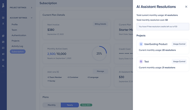
Decision #4: How do AI Assistant resolutions work across projects?
AI Assistant has a free resolution quota included in each plan, plus a paid add-on for additional resolutions. With multiple projects, the question became: is the quota shared across all projects, and how does billing work?

Decision: AI Assistant resolutions are billed and quota'd at the account level. All projects draw from the same pool. The subscription page shows the account total alongside a per-project usage breakdown, giving admins visibility into which projects are consuming the most, without creating separate billing per project.
Consistent with the limits principle
This decision follows the same logic as all other limits: account-level ownership, project-level visibility. The per-project breakdown is informational, not structural. It helps admins manage usage without fragmenting billing.
Decision #5: How does the invitation flow handle multi-account edge cases?


The invitation flow had to handle cases where an invitee already had a UserGuiding account, potentially under a different company. Each scenario required a different system response. Mapping these edge cases explicitly prevented engineering from making assumptions that would have created bugs post-launch.
Decision #6: How does the Activity Log change?
The Activity Log previously tracked all events in one flat list at the account level. With the introduction of projects, events needed to be categorized: some belonged to the account, some to a specific project, and new project-related events needed to be introduced.

Decision #7: Project switching from Account Settings (UX edge case)
Account Settings lives at the account level and doesn't show the project switcher dropdown, because account settings aren't project-specific. But the Projects list page inside Account Settings shows all projects, and each has a link to that project's Settings.
The Edge Case
If a user is in Project A, navigates to Account Settings, then clicks into Project B's settings from the Projects list, they are silently switched to Project B. They arrived from Project A, they're now in Project B, and nothing told them this happened. This is a predictability failure.
Solution: A project switching animation was introduced specifically for this transition. When a user clicks into a different project's settings from the Projects list, a brief visual confirmation of the project switch plays before the settings page loads. This makes the context change explicit without requiring an extra confirmation step.
This is a small interaction, but it addresses a real cognitive gap and it's the kind of detail that prevents support tickets and user confusion at scale.
04. INFORMATION ARCHITECTURE
The new structure, fully mapped
With all major decisions made, I built the full IA reflecting the new hierarchy. This wasn't a deliverable for its own sake. It was the shared reference that kept product, design, and engineering aligned throughout development. When multiple engineers are building different parts of the same system simultaneously, the IA is what prevents conflicting assumptions.

The IA made explicit which settings live at account level vs project level, where team member management surfaces, how project switching affects navigation context, and where limits and billing data appear. These details matter enormously, and they're easy to get wrong if they're not documented before development starts.
05. LANGUAGE SYSTEM
Account-level management, project-level inheritance
Languages presented a unique challenge because they sit at the intersection of UX, pricing, and product organization. The question was: should teams manage languages per project, or at the account level?

Decision: Languages are managed at Account Level
Language availability is a subscription concern, not a project concern. Teams add languages to their account, and all projects can use any language in that pool up to the plan limit. This keeps billing logic clean and prevents teams from having to manage language settings repeatedly across projects.
06. PRICING & MONETIZATION LOGIC
Design had to understand the business model
Adding projects wasn't free, it was a new axis of monetization. I worked with the product team to map how projects would be reflected in the pricing structure, and how containers (the unit used for installation) would scale per project.

The key design question wasn't visual, it was logical:
When a user tries to create a project beyond their plan limit, what happens? I mapped the decision tree: feature enabled check → project limit check → success or appropriate modal (upgrade prompt vs support contact). This logic had to be defined before any UI was designed, because the UI had to reflect it accurately.
07. UI DESIGN
The smallest part of the project, deliberately
Given the scope of systemic change, new UI was intentionally minimal. The only genuinely new surface was the Projects page, a management view where account admins can create, view, and switch between projects. Everything else was repositioning existing UI within the new hierarchy.
Projects List Page

Project Switcher

Project Overview
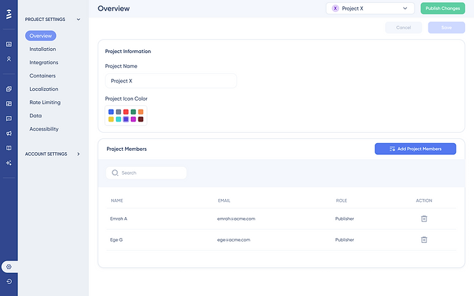
Project Member Add Drawer

The team member flow required the most UI work because it now carried an additional layer: project assignment. A team member invite now needed to specify not just their role, but which projects they have access to. The challenge was adding this complexity without making the flow feel significantly heavier.
AI Resolution Breakdown
08. USER FLOWS
Every scenario, mapped screen by screen
Because this project touched so many existing flows )and introduced new ones) I documented each scenario at the screen level. This wasn't just for handoff; it was a design tool. Mapping flows screen by screen is how edge cases surface before they become engineering problems.


In total, 11 user flows were documented across project creation, deletion, switching, member management, settings migration, activity log access, and AI resolution monitoring, each mapped at the screen level with annotations for edge cases and system states.
09. VALIDATION
Internal usability testing on high-fi wireframes
Given the systemic nature of this project, I ran usability sessions internally with colleagues across product, customer success, and support, people who regularly work with real customer scenarios and could evaluate both configuration logic and end-user impact.
Testing on high-fi wireframes was a deliberate choice: the goal was to validate structural decisions before they were hardened in code, not to test visual polish.
Test Overview
- Objective: Evaluate the usability and intuitiveness of the new Project Management System
- Participant: Colleague unfamiliar with the Banner feature
- Duration: 25-30 minutes
- Method: Think-aloud protocol with task-based testing
- Focus Areas: Feature discovery, New Project Creation, Existing Project Settings, Adding Team member to the project
Removing member, AI Assistant resolution breakdown, Project Switching, Project Delete
What Held Up
The project creation flow, role and permission model, and backward compatibility behavior were all understood correctly by participants without explanation.
What Was Refined
The team member invitation flow, specifically the moment where project assignment is introduced, created hesitation. The final design added clearer progressive disclosure to reduce cognitive load at that step.
* Due to privacy considerations, raw session data is not shown. Findings are based on anonymized feedback and internal evaluation scenarios.
10. OUTCOME & LEARNINGS
What shipped and what I took away
The Multiple Project System shipped as designed. Existing accounts were migrated seamlessly into the new structure with no data loss and no permission breakage. New accounts could create multiple projects from day one, with clear access control and plan-aware limits.
Beyond the feature itself, this project established a new structural pattern for UserGuiding, one that future features can build on without rethinking the hierarchy from scratch.
Key Learnings
Systems design is mostly invisible
The most important work in this project wasn't the UI, it was the decisions made before any screen was drawn. Making those decisions visible and documented was as important as the design itself.
Minimal UI can be maximum impact
This project introduced only one genuinely new screen. Restraint in surface area, combined with depth in system logic, is what made this scalable and maintainable.
You can't design permissions without understanding pricing
The question of who can see MAU data was actually the question of who makes payment decisions. These two are inseparable, and any permission decision made without understanding that connection will break somewhere down the line. Understanding the billing logic first made the permission structure obvious.
Backward compatibility is a UX decision, not an engineering task
Engineering says 'we'll write a migration script' and moves on. Design asks: 'What does this user see when they open the app tomorrow morning? Are their existing permissions intact?' If nobody is asking how existing users will experience a structural change, that question belongs to the designer.
Mapping 5 edge cases was worth more than 50 usability tests
Designing for both creators and end users requires holding both mental models. Optimizing for one at the expense of the other creates problems downstream.
Check My Other Projects in UserGuiding